MailSift Branding and UI
MailSift is an email parsing app aimed for small businesses that I helped develop at Angelhack 2015.
Role
Branding and Identity (logo and hand lettering), UI
Background
MailSift is a mail parser web application aimed for small businesses. It automatically sorts and categorizes emails based on the content of the body message via sentiment analysis, so that you can prioritize and resolve issues from customer feedback. This is a project I worked on with a team of developers at AngelHack Silicon Valley 2015, a 24-hour Hackathon. It won the Best use of HP IDOL OnDemand Award.
Challenge
My team and I drew ideas from ways we could improve efficiency at the small companies we had worked with. It’s not uncommon, in these smaller companies, for employees to take on more hats than their titles reveal. We shared mutual experiences in the companies we’ve worked at where the responsibility of customer service would fall on whoever would be able to, most often only one or two people. We took on the challenge of creating an app to ultimately help employees provide the support their customers need, no matter how big or small their company is.
Process
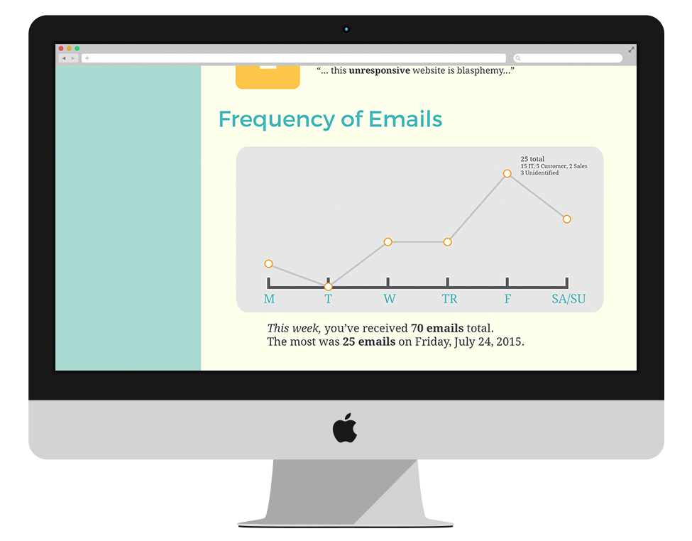
Since our app dealt with email data, I sought out visual solutions that made it simple and easy to digest and to use, as well as make it fun and fresh. I explored different ways to display information, using charts and data visualization.
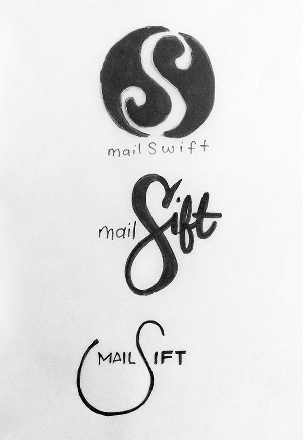
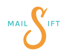
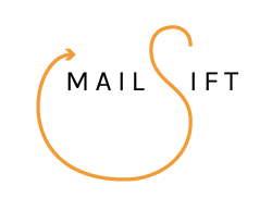
After deciding on our app’s name, I immediately started sketching out some ideas for logo. I started fleshing out the the ideas I liked best on Illustrator, and getting feedback from the team.
Sketches → Digital drafts


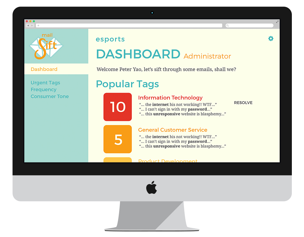
Final logo and UI
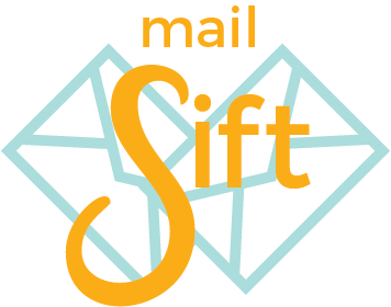
We decided on a logo that combined all our favorite parts of the drafts I created. From there, I created a UI based on the idea that we wanted our app to demonstrated friendliness, fun, and ease-of-use.
Reflection
Working under a short time constraint, it was amazing to see how much a team can put together. This taught me to trust in your team, our ideas and product. It taught me the how to trust in your design and make the best of what you can in the time you’re given. This meant stripping it down to the simple necessities to convey the heart of your product.