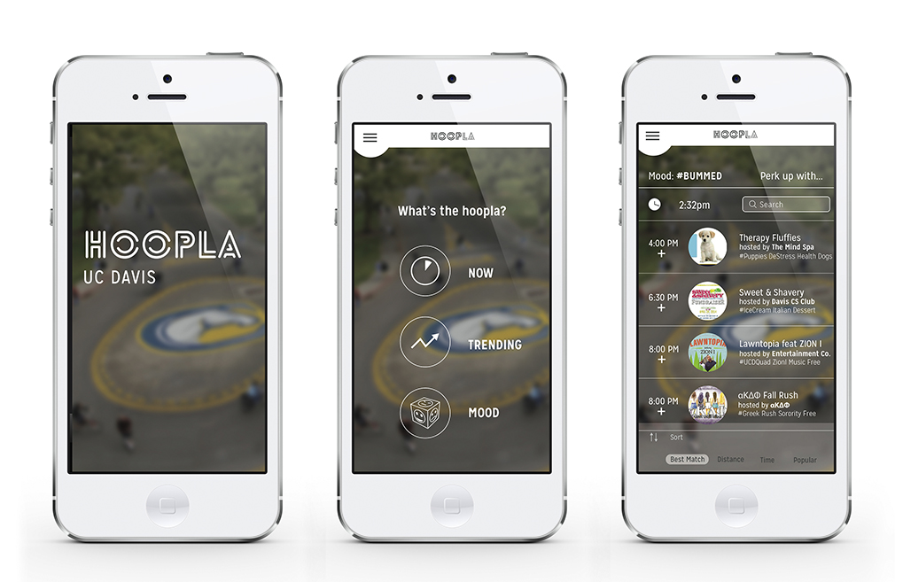
Hoopla Mobile App
Hoopla is a mobile app project that helps college students connect with student groups, events and resources available to them on their campus.
Role
Design research, visuals, user interface, prototyping
Background
In my Design for Understanding course, we were tasked to reflect on our college experience, and the things we wished we had known about as freshmen. Stephanie Pi, my design partner, and I shared the same idea that our experiences outside of the classroom, through clubs or events we attended, were what enriched our lives the most. We decided we wanted to connect students to the organizations, events and resources available to them at their university.
Challenge
Due to the sheer abundance of of organizations, events and resources in most colleges, it is not as easily accessible as one may think to get involved in their college community. We sought out to create an interactive phone app that organizes all the events, organizations, and resources on campus. We wanted to make it fun, engaging, and useful.
Process
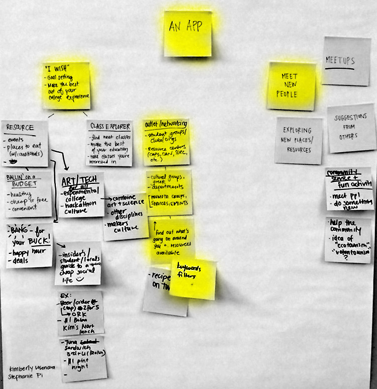
Before creating Hoopla, we conducted research on the use and need for the app idea we wanted to materialize. We had the general idea that we wanted it to promote discovery and connection amongst the university community after many brainstorm/post-it sessions. Then, to get a feel for the demographics and behaviors of our target audience, we sent out a Google survey to a different assortment of students to get a feel for how the public would react to our ideas.
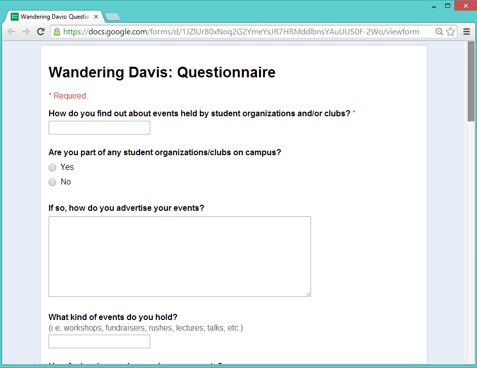
From the results, we gathered valuable information and insight on how to develop an app catered to the needs and wants of our target audience.
Need –> Features
After the analyzing the feedback we received, we focused on three main features we wanted to explore with our app:
- Filtered searching based on mood, time, location, popularity (trending)
- User and organization profiles
- Discovery: catered or randomized suggestions of events or organizations
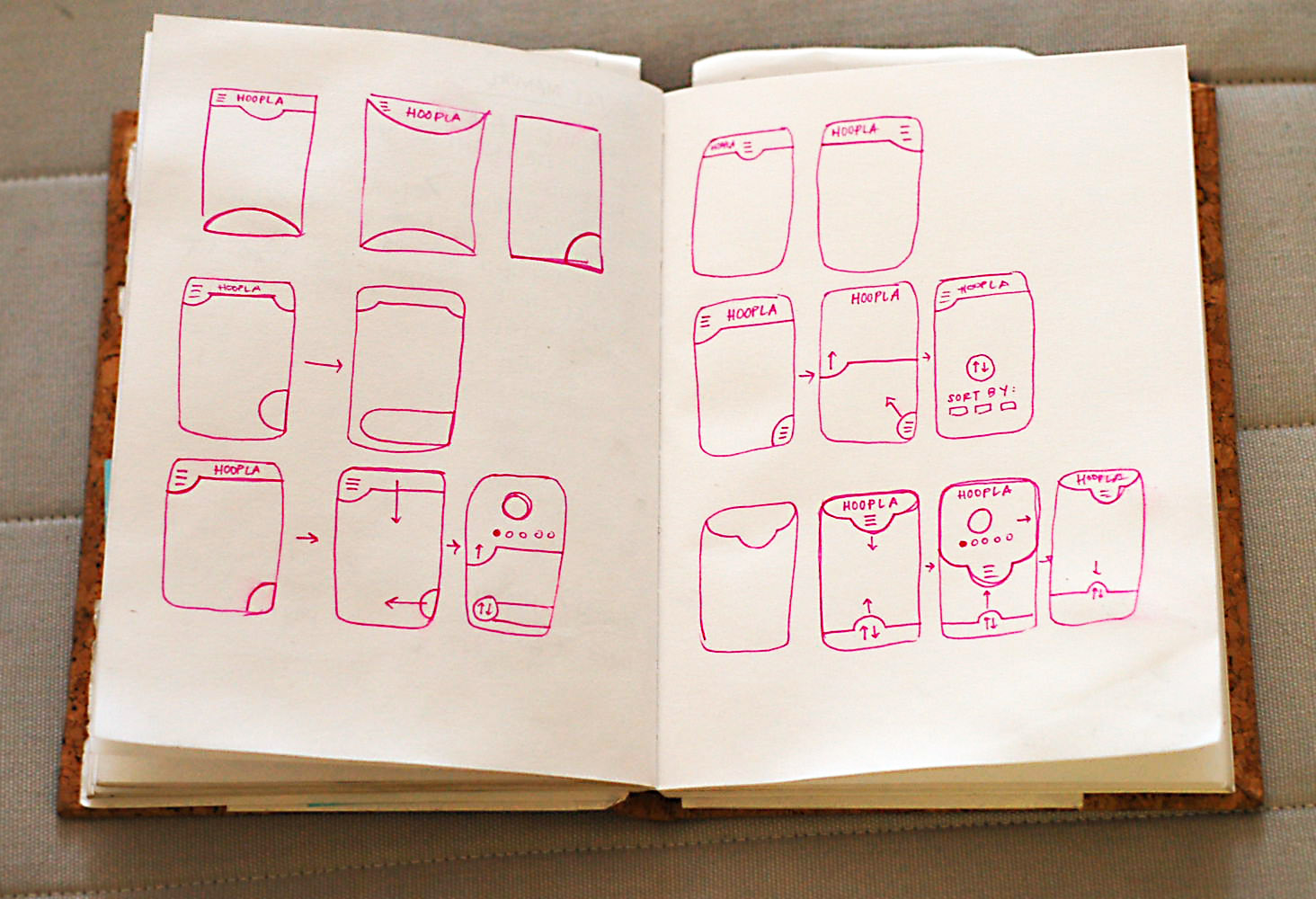
From there, I sketched wireframes for each screen that we needed to present our product. We then started designing the visual look of our app. My partner and I had two different ideas for the visual design: mine steered towards bright colors evoking excitement, while Stephanie took a minimalistic and modern route. In the end, we both agreed on a visual design that melded the best and most relevant aspects of our aesthetics: modern, fun and user friendly.