All Together Mobile App
All Together helps bring people together in an fun, easy, and organized way.
Services
User research, user interface, rapid prototyping and wireframing
All Together
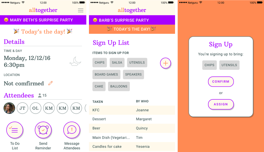
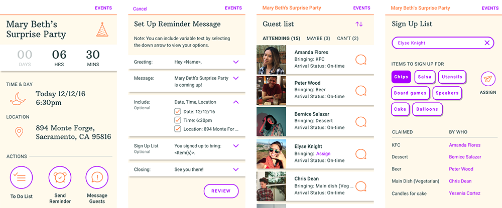
All Together is an event planning app that aims to assist hosts in all the important aspects of event planning in one centralized place. It focuses on:
- Creating a To-Do list
- Delegating tasks or items via sign up list
- Communicating with guests
- Keeping track of your events and guests
Background
I developed this app while taking a 6-week part-time course with Whitespace, a design accelerator program in San Francisco.
Target Market and Competitive Analysis
For this course, I decided I wanted to work on an event planning tool for event hosts. With that established, I went straight into brainstorming and researching my target market.
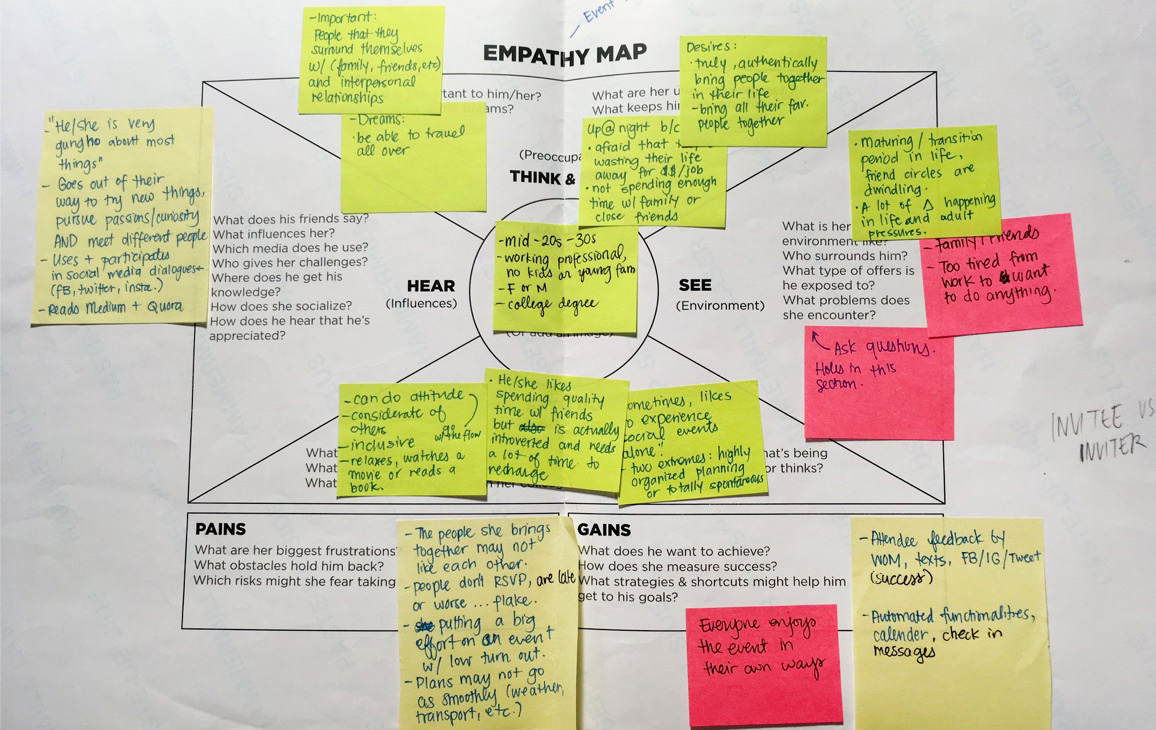
I created empathy map to pick my user’s brain about what pains, or worries they had regarding event planning, a well as what’s the big motivator that makes people still want to plan events despite those pains.
From there, I did background research on other apps and tools out on the market. I asked around and looked into what people in my target market use to plan or organize events and how and why they were successful, useful, or delightful.
Some apps that came up were:
- Facebook Events and Messenger
- Fete
- Frenzy
After determining how these apps facilitated communication, I began to gravitate towards an approach where messaging was the main conduit for communication between the host and the guests.
User Story and Storyboard
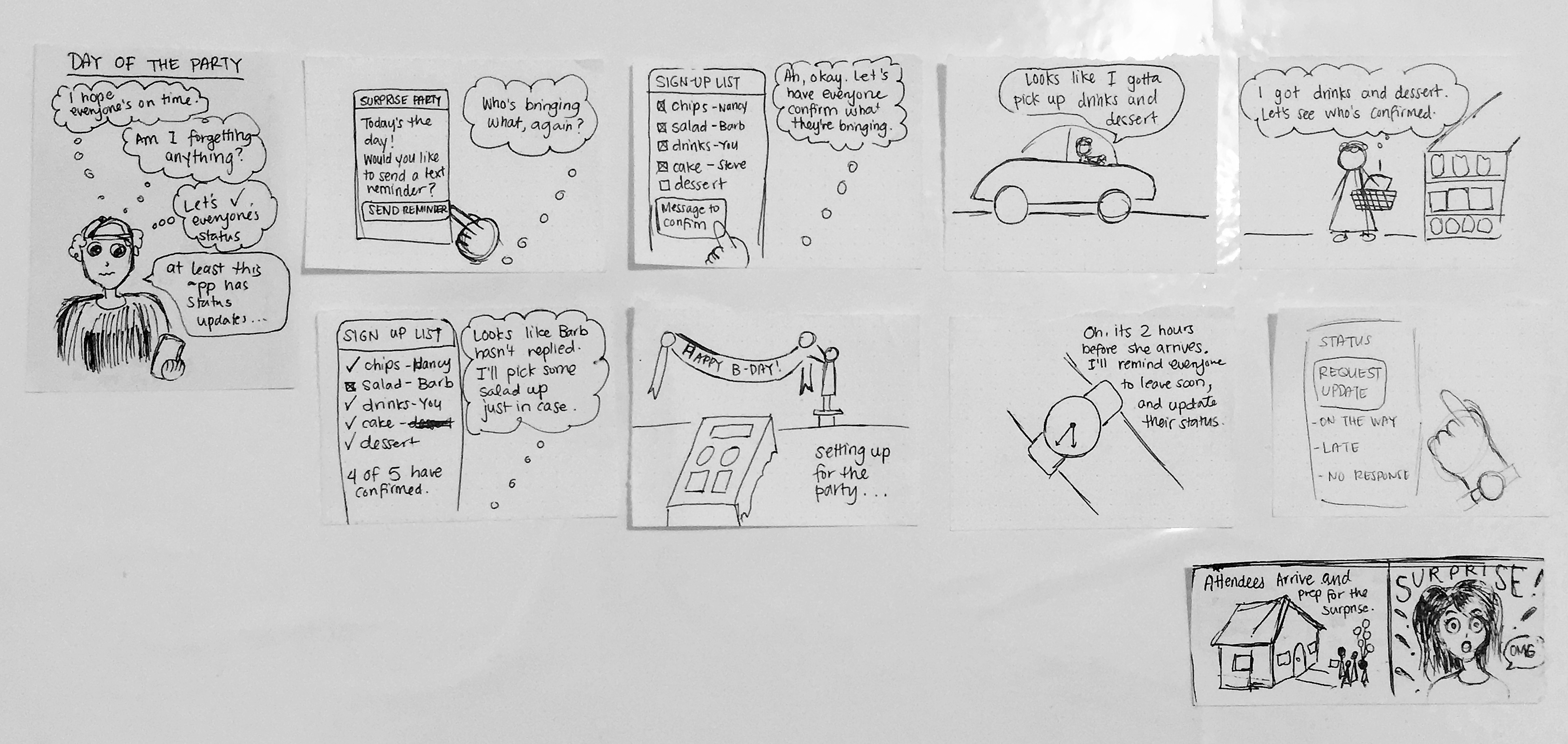
To help define more of the parameters of my product and pinpoint my user’s big motivator, I constructed a user story:
On the day of the party, I want everyone to arrive on time with what they signed up for, so that it can be successful and everyone has a good time.
Essentially, the host wants everyone to work towards one goal (celebrate a birthday, etc.) and enjoy each other’s company. I leveraged this story to direct my design decisions to address this specific use case.
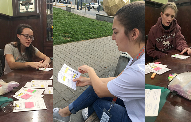
Paper Prototypes and Initial User Testing
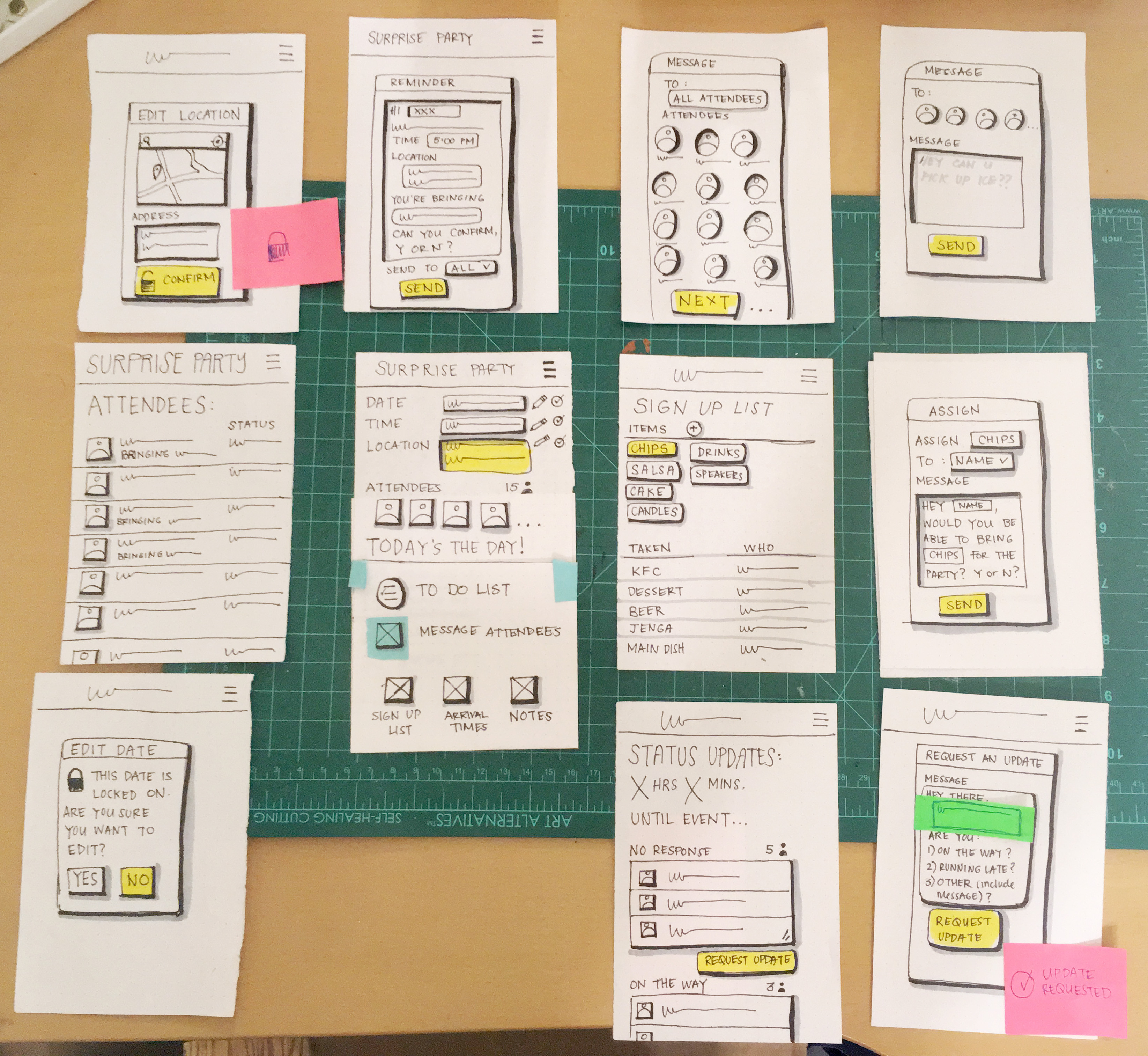
After defining the important user details and a general idea of the functionalities of the app, I put it straight to paper and created rough paper prototypes. These ended up being the wireframes that I used to test the functionalities out on real people.
The feedback revealed to me:
- What people care most about
- Things that people were looking for (task manager/to-do list) in my app
- What cause confusion (i.e. using legends, the different connotations of words and labels I set up)
Visual Design and Iterations
With my apps functionalities validated by my user testing, I was ready to dive into designing the app with some confidence. I put together a style tile conveying my app’s aesthetics through color, type, and graphic stylings and applied to my interface.
I worked towards a UI that had a modern, fun and reliable feel. Purple as modern, orange as fun and a deep blue-green to ground everything out. I stuck to mostly using shapes with rounded edges to reaffirm a feeling of friendliness and fun.
First Iteration
My initial UI captured the gist of what I wanted to go for (simple and fun, with actionable items and overview), but it still needed some work. Before attempting to spend tons of hours on making it pixel perfect, I went and tested it out on 3 users and got some feedback.
“…my brain feels a little overloaded with information because it all looks like one block of text.”
“Some of the actions and certain information seem more important than others but are not organized that way in the app…”
In doing this, I was able to prioritize and tackle the most problematic areas in the design, which were:
- Possibly too much information presented
- Prioritization of tasks
- Lack of strong visual hierarchy
Final Iteration (For Now)
After multiple iterations, my final design came about from:
- Strengthening the visual heirarchy
- Scaling back color
- Simplifying flows
- Creating more whitespace for the design to breathe
Hereafter, I am thinking about more clever ways to display complex and lengthy information and improving the visual design. Stay posted on future updates in the next couple of months!
Take Away
My biggest takeaway from this course was how the product design process is not linear. There were many times where I had to go back to previous steps and do more user testing to help validate my design decisions. In doing so, stepping back enabled me to take confident leaps forward. It showed me how iteration (aka failing often) is key to creating a successful digital app that is truly user-centered.